
KVT – When Less can be Best

KVT in minimal mode
Saw some art work on Sunday that put the cherry on top of the frosting of a great weekend.
But first to digress a little …in a personal opinionated way.
Yonks ago when I was in my second year of art school I was lucky to have a teacher who had just returned from a year long art residency in Basel, Switzerland.
The year had a profound effect on Yurick. He left as a fussy figurative painter but came back as a minimalist doing profound work with bright pink sheets of industrial pegboard.
Just after he returned he won a contract to provide a sculptural entrance to a new public building and gave it a huge, bright pink shipping container that thrust its way from the building’s foyer onto the pavement…fabulously phallic.
That was the same year that I decided to give canvas the flick and paint on wood. I’d persevered, with varying degrees of success, on 3D pieces influenced by Russian constructivists and now with Yurick as teacher, was working on a cityscape using long MDF boards, 2 metres x 20cm. I was painting text shapes using household enamel and by the end of the twenty-week term had about 30 leaning along a wall.
A week or so before the assessment panel was to critically comment on the work I decided to add a very long, pale green fluorescent tube.
When Yurick saw it lit up amidst the painted boards, he unplugged it and, with me trailing after, took it to the school’s empty gallery and installed it by itself.
It was my first and most important lesson that, often, much less can be definitely much better.
To cut a long story short, I received an A mark for the cityscape and another for the lone light.
No wonder I’ve been a Dan Flavin fan ever since.
My art school education was, thankfully, punctuated by a couple of artists with Yurick’s ethos and as I watched I saw those students with the most talent being challenged, often aggressively, as they were encouraged to rethink their concepts.
One, for her all-important final year assessment, scrapped a term’s work and replaced it with a sound conversation that won her a national student prize. Another, sculpting in lego blocks, reduced his final work from hundreds to one small yellow piece on a white pedestal. He’s now an award-winning architect.
As for me, I was in the throes of being besotted by hard edge geometric abstractionism which needed to have thick rolls of masking tape at the ready.
In an around about way this leads me back to that exhibition I saw last Sunday at The Viet Art center in Yet Kieu by a Vietnamese mid-career artist.
Vuong Tu Lam seems to have made a decision, as do some sensible artists who are not content to sit on whatever laurels they have earned, to explore new directions in making art. Anh Lam’s personal adventure was to explore the paths leading to minimalism. From what I read he went back to Cezanne’s theory of cylinders, spheres and cubes….pushed on to the geometrics of Mondrian…and went beyond Rothko’s soft edge and started experimenting.
What the curating needed was a taste of Yurick.
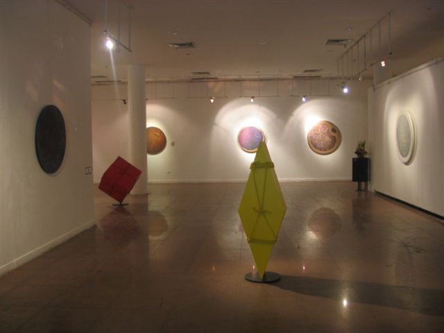
While I found his large primary-colored boxes and cylinders interesting, I thought that they’d be far, far more effective as sculptural objects without their rope bindings.
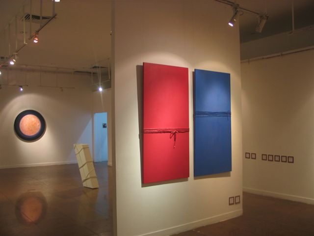
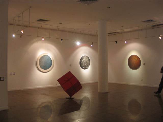
While his continued work on round canvasses, each 120cm in diameter, is a really nice concept – and I wish I knew where I could get some stretched for myself to work on – for me most had too much patterning, incising or texturing to viscerally grab me.
So what, then, was the cherry?
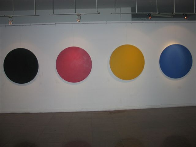
The five monochrome canvasses… red, yellow, deep blue, black and white that paraded along one gallery wall! They were just about all that was needed.
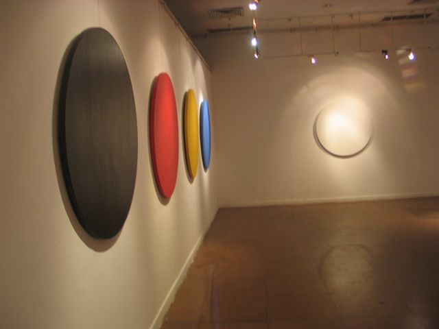
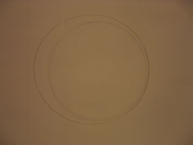
Now add my favorite work of the lot, the suspended steel hoop that cast a soft-edged round shadow on a wall behind and you’d have quite a show.
But, then, I’m a sucker for good monochromatic work, have been since my Yurick days. Send me to a gallery or art museum full of the stuff and you’ve got one very happy chappy. I’m not talking about the soft and semi-spiritual fields of Rothko…I’m hooked on canvasses smothered in dense stuff like Yves Klein Blue, deepest black, lemon, candy pink, acid green, enveloping white. Surfaces covered in monochromatic shades using mediums as diverse as charcoal and metallic automobile enamel.
So thanks Vuong Tu Lam for allowing me to revel for a while in the wonders that pervade the world of minimalism ….
Note: For another opinion about this exhibition, please see the comments by Ilza.
![]()
| Kiem Van Tim is a keen observer of life in general and the Hanoi cultural scene in particular and offers some of these observations to the Grapevine. KVT insists that these observations and opinion pieces are not critical reviews. Please see our Comment Guidelines / Moderation Policy and add your thoughts in the comment field below. |


Hi KVT,
…reading with interest about your creative endeavors — good on you….and also, glad that discussions start to pick up on HGV!
Cheers!
P.S> Concerning the stainless steel loop…oh yes, the cast shadow was there for sure — how otherwise?.. but the painted circle on the wall was there too…
Best,
I